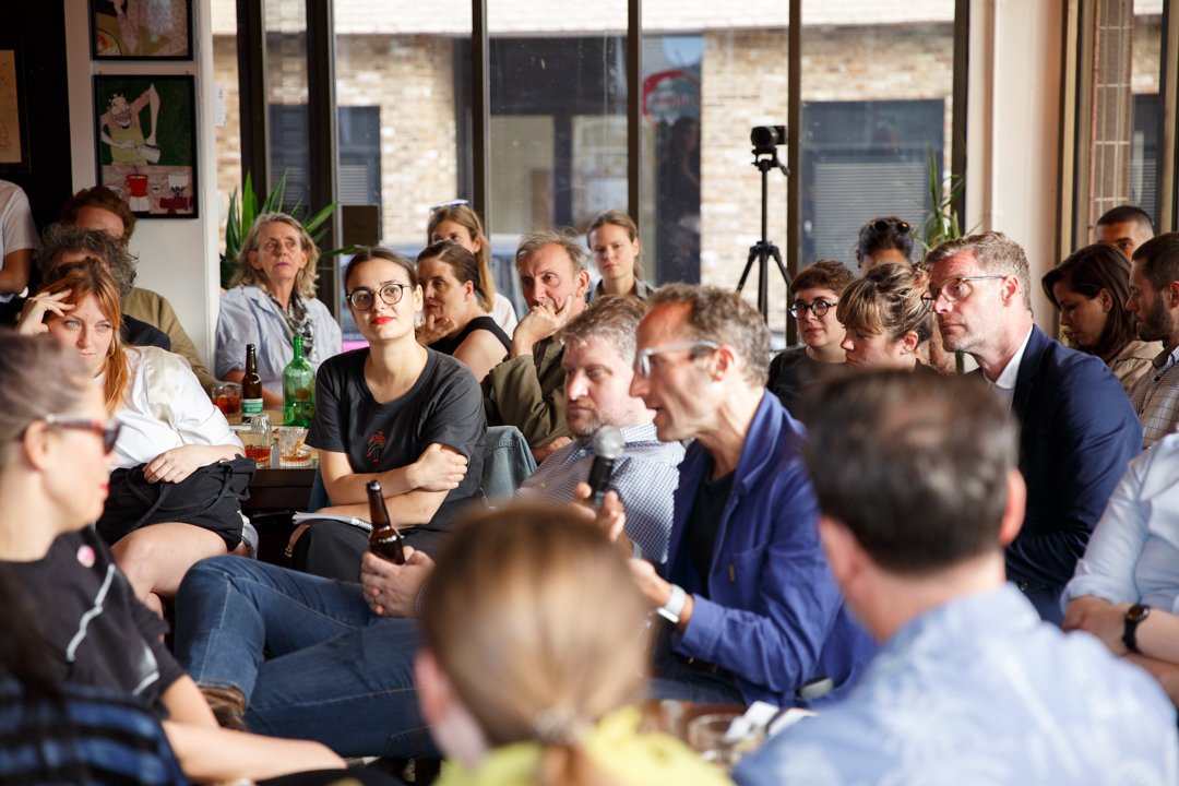
The London Festival of Architecture has always proved to be a platform for vigorous debate – both about our theme and about wider issues affecting London. On our Views Pages we give space to a range of contributors including industry leaders, curators, academics, politicians and other less-heard voices to express their views and ideas. These are their opinions and not necessarily those of the Festival. We hope you find them in equal parts inspiring and challenging.

BLOG POST | |

Manifestos: Architecture for a New Generation No. 3


  • In an exciting collaboration with the Design Museum, ‘Manifestos: Architecture for a New Generation’  highlights the work by 10 emerging voices in architecture, who have each been nominated by  established names in the profession, for their impact on shaping a new future for London. Responding to the defining challenges facing young people in London today, this new generation of architecture voices pushing the boundaries of what architecture can be, who London is for and what its future holds.
  • In a series of visionary manifestos, the chosen 10 share alternative visions for the capital’s urban landscape, prioritising collaboration, dialogue, learning and action in response to the real material and social conditions of a city in flux. Check back every Wednesday and Saturday for more.


Joseph Henry (nominated by Asif Khan)

with Priya Khanchandani & Jayden Ali


There is the potential for architecture to become more relevant to the citizens of London. Architecture and architects will need to embrace more diversity. It will require the architectural profession shifting into a type of spatial agency resembling a broader architectural culture. Architecture and architects will need to embrace and support more diversity, including both the diversity of practice and the diversity of the practitioners, expanding the worn-out architectural tropes into a more pluralist space for practice and collaboration. The traditional practice of architecture (i.e. the building of buildings) is often slow but the creating of ideas by architects is often not. By architects mimicking the practice of artists in the realms of music, art and fashion and finding lighter and faster experimental ways of improving peoples’-built environment, architecture can start to absorb and contribute to the wider cultural narratives of the city.


BLOG POST | |

Manifestos: Architecture for a New Generation No. 2


  • In an exciting collaboration with the Design Museum, ‘Manifestos: Architecture for a New Generation’  highlights the work by 10 emerging voices in architecture, who have each been nominated by  established names in the profession, for their impact on shaping a new future for London. Responding to the defining challenges facing young people in London today, this new generation of architecture voices pushing the boundaries of what architecture can be, who London is for and what its future holds.
  • In a series of visionary manifestos, the chosen 10 share alternative visions for the capital’s urban landscape, prioritising collaboration, dialogue, learning and action in response to the real material and social conditions of a city in flux. Check back every Wednesday and Saturday for more.


Stephanie Edwards of Urban Symbiotics (nominated by Elsie Owusu OBE)


Architecture and Urbanism is at a crucial turning point. Set within a world undergoing intense social and technological change, the sector must respond and adapt to London’s growing expectations by facilitating new and inclusive ways for life to be experienced.

The real needs of people must be addressed to provide more relevant human spaces. This should be achieved by prioritising user insight through research and targeted engagement of people, providing a flexible vision.

A cross-disciplinary focus and delivery needs to be adopted. We must interrogate the relationship between physical, digital and social spaces to create tailored environments. By responding to behaviours, we can innovate developments in cities.

The future is exciting and provides a critical opportunity to re-invent human connection to the urban fabric, creating unified environments that meet the ever-evolving needs of London’s dynamic population.

BLOG POST | |

Manifestos: Architecture for a New Generation No. 1


  • In an exciting collaboration with the Design Museum, ‘Manifestos: Architecture for a New Generation’  highlights the work by 10 emerging voices in architecture, who have each been nominated by established names in the profession, for their impact on shaping a new future for London. Responding to the defining challenges facing young people in London today, this new generation of architecture voices pushing the boundaries of what architecture can be, who London is for and what its future holds.
  • In a series of visionary manifestos, the chosen 10 share alternative visions for the capital’s urban landscape, prioritising collaboration, dialogue, learning and action in response to the real material and social conditions of a city in flux. Check back every Wednesday and Saturday for more.


Alpa Depani (nominated by Pooja Agrawal)


Architects have all the tools, and the remit, to contribute positively to a London that remains inclusive, safe and sustainable. Increasingly, architects are stepping out of traditional roles and finding ways to cross professional boundaries and to collaborate to meet those challenges. This is good, but it is not enough.


Look to the mainstream of the architectural profession and it remains remarkably retrograde on issues of diversity, fair and equal pay and efforts to reduce global warming. If architecture is to look outward and to respond with empathy and intelligence to the issues that our capital faces, from one generation to another, it must first look inward, confronting its own bad habits with a willingness to adapt and change.

BLOG POST | |

For the love of colour – Visiting Yinka Ilori and Pricegore’s ‘The Colour Palace’


  • Ilaria Vignolo is Marketing and Communications Coordinator at New London Architecture. In this piece she shares her first impressions of ‘The Colour Palace’, an installation designed by Pricegore with Yinka Ilori for the London Festival of Architecture, the second edition of the Dulwich Pavilion at Dulwich Picture Gallery. The pavilion is on view until 22 September.


“This makes me want to cry… tears of joy” laughs my friend, giving a quick wipe behind her sunglasses. We are stood at the entrance to the grounds of the Dulwich Picture Gallery and have just set eyes on the Yinka Ilori and Pricegore-designed ‘The Colour Palace’, created for this year’s London Festival of Architecture – a huge cubic pavilion painted a rainbow of colours, sitting on four huge cylinder-shaped ‘stilts’ .


I had been meaning to visit the gallery for years, but a glimpse at the colossal multi-coloured pavilion on the LFA newsletter, a collaboration between British-Nigerian artist and designer Yinka Ilori and architecture practice Pricegore, followed by a fascinating LFA talk at Shoreditch-based learning network YCN, was exactly the prompt I needed to make the trek down from east London.


The talk, ‘Graphic Content’, responded to this year’s LFA theme of ‘Boundaries’ by looking at the fluid, blurring boundaries between graphic design and architecture, two disciplines which have never been more entwined than they are now. A panel of design thinkers including Russell Potterfrom creative studio SODA, Joy Nazzarri of dn&co, Martyn Evans of U+I plus superstar designer and artist Morag Myserscough took turns to share their thoughts on the ways designers shape environments through bold visions and beautiful forms.Coincidentally, Morag was also one of the judges for this year’s Dulwich Picture Gallery LFA pavilion design competition won by ‘The Colour Palace’.


Russell Potter raised the question ‘how can designers represent architecture on a 2D surface?’. He used SODA’s own Compton Courtyard Mural as an example, now an Instagram star in its own right; a layered jungle landscape printed on to the façade of their studio, which reflects the hidden garden within the courtyard. ‘The Colour Palace’ exemplifies this beautifully. The structure is inspired by the colourful prints sold in a Lagos market, where the traditional textiles hang, densely layered, from wooden frames. As Ilori points out, it is also very much ‘representative of today’s London’ as it is intended to represent a culturally diverse London and ‘attract a much wider audience to the gallery’. It responds to the LFA’s chosen theme by fusing the boundaries between European and West African traditions.


After emerging from a winding bus journey and walk through quiet, residential Dulwich, we are met with a view that feels really quite surreal. In the middle of the manicured gallery’s lawn, we are greeted by an explosion of colour and geometric patterns, bright, bold and eye-catching. People of all ages are exploring the interior of the installation or sprawled around it, engaging in creative pursuits from neon life-drawing painting, stitching a collaborative pattern or interacting with the immersive installations dotted around by students from the Bartlett School of Architecture. The sight breeds an atmosphere of optimism and exudes positivity – no small feat when faced with relentless news of the political climate and climate crisis these days.


At ‘Graphic Content’, U+I’s Martyn Evans talked ‘using design to make a temporary space beautiful quickly and totally change the perception of a place’ invoking Morag Myserscough’s magnificent, psychedelic public art installations, which embody her famous mantra ‘make happy those who are near and those who are far will come’. Applying the ‘far’ of this motto to our hour-long commute into the leafy suburbs may be a bit too literal, however I will say that ‘The Colour Palace’ filled me with joy and swelling pride, as a Londoner, to be part of this colourful city. If you like it and happen to have £25,000 to spare, for some magical reason, you may even be able to buy the pavilion after its stay at the Dulwich Picture Gallery. I just hope that, wherever it ends up, it will remain in public view and continue to affect everyone who sees it.


BLOG POST | |

On Apps and Infrastructure

  • In his first essay for our Views section, KB Yeoh explores how apps  are affecting the space between our buildings and how infrastructure is failing to keep up.  KB is an associate and project manager at Jackson Coles.

Deliveroo, Uber Eats & Just Eat- a few examples of the wonderful little digital helpers on those nights when one comes home late with an appetite but to an empty fridge. The couriers on the front line zipping around tirelessly like a modern concierge servicing the city at large helping urbanites smash through boundaries of consumption like never before. Ultra-convenient yet a challenge to the traffic lines of our city’s public pedestrian and retail spaces.

On one such service provider’s website, it pontificates to its riders- “Shopping centres and malls can be extremely busy and tend to be no-cycle zones. When collecting an order in these areas please park your bike safely and securely outside the centre, using cycle stands or other cycle parking facilities wherever possible”.

Take Westfield Stratford for example- If delivery cyclists were to adhere to this, it would be reasonable to estimate that an extra 10 to 15 minutes in some cases would be added to each journey. When a rider is paid not only by the hour but also by the number of deliveries they fulfil, it is no surprise that many have taken the risk of collision – navigating through these busy pedestrianised zones rather than dismount to maximise their delivery results.

The problem is exacerbated by the inadequate number of cycle stands to cater for the demands of this service provider. These cycle stands are positioned at the entrance to the complex and also far away from some of the eateries located deep into the centre itself.

As the food delivery sector becomes more competitive, the problem looks to worsen.  In recent years, spending thresholds have fallen to encourage more orders which in turn will mean more riders racing against the clock. I put the theory to the test and recently ordered a single dipping sauce delivered to my home (Sauce costs 40p with a 50p delivery charge- all in the name of research, of course). Within 15 minutes, an eager and very polite man on his scooter came bearing the fruits of my experiment. I gave the man a generous tip for his trouble and promised not to repeat my belligerence.

So whilst food delivery apps have the ability to broaden the home dining scene, the pressured mind-set of the rider versus the physical infrastructure on our roads, pavements and public realm have yet to adequately follow suit to support the evolution of this urban phenomenon.


BLOG POST | |

Without Walls

For our Views Section, LFA Patron Ft’work presents a series of three, hard-hitting short films, produced in collaboration with Sarah Wigglesworth Architects and community-based organisations. These videos each explore this year’s LFA theme of boundaries.  Each film explores boundaries from the point of view of a particular social group, whose experience reveals where social and physical boundaries collide.

In this first film ‘Without Walls’ captures conversations between women who have served prison sentences, as they share experiences of physical confinement and discuss ‘women’s centres’, the intended replacement for women’s prisons.

The two other videos in the series ‘Regeneration Divide’ and ‘Postcode’ will appear weekly over the next two weeks,

BLOG POST | |

Jamie Sherman on Boundaries

  • Jamie Sherman is a partner at Kingston Smith. Kingston Smith’s origins go back 95 years and many of our client relationships span decades. Our partners have unparalleled knowledge of compliance needs, international and UK accounting standards (IFRS and FRS102) and SRA Account Rules, as well as general tax planning and financial management. Beyond these essentials is our added value – the business and strategic advisory support we offer in growth, international expansion, profit sharing, employee incentives, and mergers and acquisitions.


Having attended the 2019 London Festival of Architecture Press Launch recently (with the pleasure of boarding a Thames Clipper service for a trip along the Thames), it seems the LFA team has once again gone all out to deliver a bigger and better festival than ever before. The month of June certainly promises to be busy for all involved in architecture in London and we are once again excited to be benefactors of the festival.

And what a great theme they’ve chosen this year; ‘Boundaries’ can mean many things to people and the programme of events showcases this. From geographic boundaries and borders, to boundaries of diversity in the profession, the events will no doubt cater for all.


Throughout 2018/19, our clients have seen many boundaries affecting their practice.  Be it around the level of competition in the industry, attracting and retaining exceptional talent or planning restrictions curtailing their creative ideas, boundaries have made the environment a tough one. While design remains at the forefront of all projects, architects have had to have more of an eye on profitability and pricing has become more of a challenge.

We have successfully helped practices to improve their conversion rates when entering competitions or tendering for new projects. This has the knock-on effect of improving morale and engagement within the practice, making the working environment a vibrant and enjoyable one. We will continue to work with all our clients to break down as many of the boundaries affecting the success of their practice as possible.

There are some excellent events in the programme with some highlights including the tour of Her Majesty’s Theatre and the Architect Pitch event, as well as an array of studio lates showcasing the work of many London practices. The Home Sweet Home Pop Up hosted by TP Bennett certainly sounds intriguing.  Add to this other highlights like the Dulwich Pavilion exhibition and the insightful negroni talks, it promises to be an excellent festival.


We look forward to seeing you there!


BLOG POST | |

Borrowed Boundaries

  • As part of the LFA Opening Party, Design Concept Store RB12 kindly decorated the beautiful Minster Building in London. In this essay, Kate Nannery, from the RB12 Design Space & Showroom, explores the theme of Boundaries. 


The theme for this years event is Boundaries and we’ve been given the task of offering our thoughts and comments on the subject. On receiving the brief we were initially struck by the restrictive nature of this word but this got us thinking…Every space has boundaries, whether that be the actual structure of the space with dividing walls and area limitations or they could even be design limitations such as compact spaces or haveing to stick to a strict client plan or vision.


We were inspired by an idea made popular by the respected gardener and broadcaster Monty Don – best known for presenting BBC’s Gardener’s World and the RHS Chelsea Flower Show. In one of his recent programmes, he talks about the idea of ‘Borrowed Landscapes’ within garden environments and we thought that could translate well into the interiors and architecture world.


The idea behind borrowed landscapes is that your garden is not restricted by its borders and limits and you can in fact use (or borrow) the landscape around you and factor that into the way you design your space. This way of designing is something we have seen first hand during our travels. In the Imperial Palace Gardens, Tokyo – home to the Emperor of Japan – this concept has been used. Above the beautiful, perfectly kept gardens filled with the traditional Irises, bamboos and mosses typical of this type of garden, you can see the highrise, metropolis architecture of Tokyo poking over the high stone walls. This gives a beautiful contrast to the space and the two landscapes contradict each other in an unlikely, but heavenly way. It’s interesting to remember that this Garden wasn’t actually built with this intention and since its completion in the late 1800’s the city to Tokyo has been build up around it, borrowing the beauty within its walls.


Contrasting landscapes at the Imperial Palace Garden in Tokyo


We believe this concept can and has been interpreted into the design of the infrastructure of our cities, homes and green spaces in the UK too. When designers and architects build and plan spaces there is no doubt that they are influenced by the boundaries and the landscape around them. The landscape can weave its rich tapestry of form and colours that frame spaces with a richness you can borrow for your own space.


Autumn colours glowing against a dark green hedge, with a depth of vision provided by neighbouring trees and fields in the distance.


It is key to start by looking at the bigger picture. What was on the land before and how does the lie of the land affect your design decisions? It’s so important to make decisions that are compatible with the land, both in and beyond your boundaries. Even with the restrictions given by boundaries, we’ve realised that you cannot forget to reflect on what’s beyond your immediate borders and use it to enhance your interior and exterior spaces.


The windows of buildings frame your landscape and it is important to consider how this view will change throughout the seasons. The placement of your outdoor furniture should be highly considered, with the best possible views in sight.


At RB12 we have beautiful collections which push the traditional boundaries of outside/inside and vice-versa. Fabula Living has just released two new rug designs that can be used in both indoor and outdoor environments. These hand-woven rugs would be a wonderful touch to any transitional area from an interior to an exterior space. Patricia Urquiola designed a range for GAN rugs which was their first exploration into outdoor environments. The collection consists of rugs, mats, roll pillows and cushions that can be arranged in many different ways, creating infinite possibilities for outdoor living. The collection is influenced by the Orient and invites its users to sit back, relax and lay out in the divine summer sun.


Another brand reaching out of traditional boundaries is the outdoor lighting collection from Masiero. The Masiero R&D team developed a special Drylight® technology which enabled them to create and offer a complete range of outdoor lighting but in stunning chandelier forms. You wouldn’t believe it, but these luxurious-looking lights are highly durable, waterproof but still light and easy to install. Another excuse to get out in the garden, even at night.


We’ll leave you with a quote from iconic Dutch landscape designer and architect, Piet Oudolf;


“A building needs green. Plants have a human scale and change over time, every day you see something different and that’s stimulating for a lot of people.”

BLOG POST | |

Frida Escobedo Designing for Maestro Dobel

How Frida Escobedo joined forces with Maestro DOBEL® Tequila to break boundaries and elevate the tequila drinking experience.

Kindly sponsoring cocktails at the LFA reception at Burlington Arcade on Friday 14 June, Maestro Dobel® tells the story of their collaboration with world-famous architect Friday Escobedo. Maestro DOBEL® is renowned in its homeland Mexico for its family of ultra-premium tequilas. Eleven generations of masters, makers and rule breakers inform its craft.

As part of this unique pairing, acclaimed Mexican architect Frida Escobedo conceived and designed a set of exclusive drinking vessels, brought to life by the eminent stone artist, Mexico City-based Juan Fraga.

Frida was inspired by thejícara, a cup made from the fruit of the calabash tree and traditionally used for drinking tequila. Each of the three spherical vessels were then masterfully hand-carved from obsidian, a naturally occurring glass formed by the rapid cooling of volcanic lava unearthed in the ‘ring of fire’ region of Mexico, where Dobel tequila is produced.

Experimental ideas, together with an innate respect for tradition, were also a driver for Escobedo during the design process. Against the vibrant backdrop of her native Mexico City, with its thriving modern art scene and rich cultural and culinary heritages, she explored the notion of connection to people and the ever-changing landscape by way of a mythical circle.

Frida Escobedo explains: “We sourced golden obsidian—a deep black stone with subtle gold nuances that appear only when touched by light—in honour of the world’s first Cristalinotequila Maestro Dobel Diamante. For Dobel Humito, we used a slightly translucent, silvery grey obsidian to reflect the tequila’s smoky attributes, while the smallest vessel is hand-carved using red obsidian—a rare mélange of red and black, for the rich amber liquid that is Dobel Añejo.”

The one-of-a-kind vessels, which were designed and overseen by Frida Escobedo Studio and realised by Fraga, required even more skill than usual to produce.

“Developing the vessels was part of a long process – one which began with an 8-hour drive from Mexico City to the Sierra of Guadalajara, in search of rare ‘rainbow’ obsidian as this contains a broader colour range,” explains Fraga.

“Each cup took around three days to craft.”


In the UK, Escobedo is perhaps best known for her bold, latticed roof-tile installation for the Serpentine Pavilion in 2018. To date, she is the youngest architect to have received this prestigious commission and her work continues to spark cross-cultural discussions wherever it is shown.

In February 2019, Escobedo was presented with an International Fellowship, one of the industry’s highest accolades, from the Royal Institute of British Architects (RIBA).

The first series of 30 limited-edition sets are available to purchase from Harvey Nicholsand are also being presented as part of a special serving ritual in some of London’s most exclusive bars, including the Mandarin Bar, at the Mandarin Oriental.

More information here.

BLOG POST | |

Brixton Boundaries, a community project by Squire & Partners and AWMA

  • AWMA are an experimental design collective whose work tells stories through art and architecture. Squire & Partners is an award winning architecture and design practice with a reputation for architecture informed by history and place. Both are based in Brixton.


Boundaries form part of our everyday experience with positive, negative, physical and emotional characteristics that contribute to shaping communities. Whilst some help us feel safe and secure, others act as barriers to growth and inclusion, affecting people from a global scale down to local neighbourhoods.

As both a small and a large design practice in Brixton, AWMA and Squire & Partners have independently initiated projects designed to engage local people through architecture and design. For this year’s London Festival of Architecture and its theme of Boundaries, we have collaborated together to explore the particular experience of boundaries to the Brixton community.

Brixton is sometimes described as a global village with its complex history and convergence of cultures, but has retained a strong community and a distinct identity which sets it apart from other London neighbourhoods. We were interested in exploring how architecture, the built environment and design contribute to the perception of boundaries.

Within the design profession, both physical and emotional boundaries play an important role in our work. Unlike physical boundaries which are documented and continually revised through legislation to keep pace with urban development, emotional boundaries are nuanced and less tangible, continually shifting and evolving. Emotional boundaries need to be continually re-assessed and updated in the way we and others perceive them.

A boundary is defined as a line that divides, creating a barrier which can be seen as rigid and limiting, and may incite fear and misunderstanding of what lies on ‘the other side’. As designers working in the community, we aim to blur boundaries to be more flexible and fluid, creating opportunity for interaction which in turn promotes understanding and respect for each other. One of the most effective and inclusive ways of achieving this is through the exchange of ideas in an open dialogue.

We invited 30 members of the Brixton community to a workshop to explore how people perceived specific local boundaries which shaped their experience of the area. The lively discussions highlighted boundaries common to all ages and backgrounds – particularly physical barriers in terms of Brixton’s town centre such as railway lines/arches or parks –  and others which only applied to some –  examples include age, outward appearance, religion or race. Traffic, noise, crowds and darkness were also important barriers to feeling comfortable. We discussed why people may not feel comfortable speaking to their neighbours, and how walking your dog is a foolproof conversation starter!


Following the workshop, we sought to share the findings and expand the dialogue into the wider community as a visual and interactive installation.

Brixton Boundaries comprises an immersive installation in five parts, revealing views and experiences through illuminations, mapping and film. A large scale word map on the window of the Department Store acts as a graphic representation of issues raised in the workshop, and poses questions to passers-by on Brixton’s unique boundaries.

Once inside The Department Store, an enclosed space features sixteen illuminated boxes projecting the ‘voices’ of participants, creating a web of overlapping perspectives on ceiling and walls, which provoke questions about how and why we experience boundaries, and ways we might be able to overcome them. The workshop is represented with a looping short film documenting the event and interviewing individual members of the group on their findings.


The final two elements of the installation encourage visitors to add their opinions and experiences to an illustrated local map using bespoke stencils, and a Boundaries graffiti wall which will evolve throughout the nine-day event.

This week we are hosting community and school groups to continue the explorations around boundaries, and look forward to seeing how their views shape and evolve the display.

For us it was important to cultivate ongoing conversations to inform our roles as designers to create shared spaces in our cities with in-built opportunities for overlapping narratives and discussions. This will help to form a future where boundaries include and empower instead of limit and exclude. It is these spaces where the unexpected happens – the chance encounter, friendship, a new idea. These are the spaces that need to be designed, culturally activated and cultivated to allow open conversation and dialogue to flourish.


© 2024 New London Architecture unless otherwise stated. Privacy Policy | Account | Site: ATGS